
 Hello readers! We thought we'd start occasionally talking about how a book LOOKS, not just how it READS. Because, honestly, we all DO sometimes judge a book by it's cover. So, today, we're tackling the Red, White, and Black elephant in the room: the Twilight-inspired trend in book covers. I just feel like they're all out of some wanna-be-1950's Diner.
 Ah, the "Paint It Black (and Red and White.)" Twilight started the trend but please, oh please, can it stop now? I mean, it's all fine and great but do you have to recover the classics in this style?
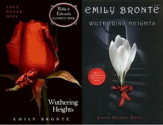
Photo credit: www.truetwilight.com
Oh, that reissue cover made me throw up in my mouth a little. I'm torn between thinking "Well, maybe now some teens may discover a classic..." and thinking "What the hell ever, I 'discovered' that classic on my own WITHOUT Bella and Edward mucking it up!" I wonder how many teens WON'T read it now, simply because of it's association with Twilight? I know for a fact that I avoid anything with the big "Oprah's Book Club!" sticker simply because I feel like it's being shoved at me.Ah, *happy sigh* now ::THIS:: this is the Wuthering Heights version, I prefer. Sorry Edward and Bella and thank you, anthropologie:
 Ooooh - pretty! I would read that again, just for the cover! (Even though I truly detest WH. Yeah, I said it.) And why does everything on the anthropologie site make we want to whip out the credit cards? *smacks own hand* I think the What's-Black-and-White-and-Red all over re-issues of classics are the ones that drive me crazy. Imagine the shock of someone opening up Pride and Prejudice and realizing Mr. Darcy is not a vampire?!? Oh wait, there is that book -- Mr. Darcy, Vampire. When will the Twi-comparisons end so we can move on gracefully??? Uh, I'm pretty sure gracefully was a few reprints ago. How about just moving on?There are SO many books out there that are using that color scheme and I always sigh and think, "Original much?" I actually pass books up sometimes that have covers in that style.Well, just browse Amazon or Barnes and Noble's "New and Noteable" Teen Reads sections and you'll come up with a ton of books that fit this subject. See? I even screencapped it! That doesn't mean I don't love, or WOULDN'T love, these books. It's just that it's getting hard to tell them all apart.
 The other day I couldn't find a book in my bookcases. Don't laugh! My bookcases are black and so are most of my book spines. I have them categorized in my own haphazard Dewey Decimal way -- no, there's not a shelf for Hot Boys with Swords, not yet -- but it took a while to find the book. I'd love to sort my books by color like in the anthropologie catalogue but, yeah, black would dominate. Hey, publishers, can we "paint with all the colors of the wind"? Please?Oooh! Do you categorize them based on supernatural creatures too? What? I do!
I think this whole cover controversy is why I was so excited to get Linger. I could have ordered the iBook (as I am now loving reading books on my iPad), but I just HAD to have Linger's amazing cover in my hands. And green font? Hello, beautiful. I think all the books (so far) in the Shiver series are amazing in their simplicity. They are so far from the red/black/white, and that makes them all the more attractive. That being said, the Italian cover of Shiver did not stray from that theme. And neither did the UK - for both Shiver and Linger. This time, I think the US version is by far the best.
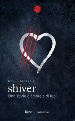
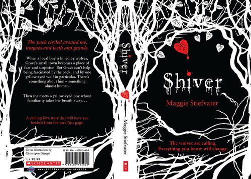 Well, I think there's this trend right now towards minimalist covers, as well. Some people seem to equate that with the Red/White/Black theme, but the US Shiver/Linger covers illustrate a way to do minimalist but still stand out. I agree. *frowns at UK Linger/Shiver covers* *hugs her green-covered-Linger close* So, readers, what do you think? Are you over the Red-White-Black-Minimalist covers, or do you think we're being nitpick-y? Let us know!


I think that the designers that are using the popularity of the monocromatic theme to lean on are ruining it for the ones that are making great designs for books that suit the color scheme. With paranormal there's always a dark or forboding theme that is represented well by something, or someone being highlighted amungst darkness. Not that they all need that, look at the Iron Fey books, they're beautiful and not black. *shrugs* I think the difference to me is the relevance of the design.*sidebra in pastels - have you seen the coverart for Darkest Mercy (Wicked Lovely 5)? It's breathtaking!
ReplyDeleteWhen the Black/Red/White emerged, I'll have to be honest, I LOVED IT! As a person who reads a lot of Fantasy novels, the minimalistic Black/Red/White theme was like a breath of fresh air.
ReplyDeleteI was kind of tired of seeing men with huge swords, or dragons or whatever on badly designed covers.
But, I do agree that the Black/Red/White is getting tired. I am all for the simplistic/minimalistic design but you are right, they need to rediscover other colours as well.
See?? We're onto something. Plus, I want my shelves to be all pretty and sorted by color which would now be just, er, black.
ReplyDeleteOkay, so I'm totally late to this party! I've been on the road for work and just have been behind on my blog reading (I should head right to the shame shame room!)
ReplyDeleteAnyway-I agree-I like minimalism, a lot actually, but I'm really quite tired of it. I love bright colorful covers--One of my absolute favorite books of all time was picked up because of the brightness and art of the cover, The Amazing Adventures of Kavalier and Clay. And, it turned out to be the BEST evah! Phew!
And, part of the reason I picked up Shiver was the cover-it's beautiful in it's colorful simplicity--the coolness of me made me feel cool while I read the book-which, is apropos. Loved it!
I just read an article in Entertainment Weekly last month that movie posters are guilty of the same thing-but with orange and blue--apparently every poster coming out these days has some form of orange and blue-it's supposed to be mysterious and draw you in or some such. But, booo, boring! Mix it up peeps!
And finally-my other peeve of YA books, and adult books, but I see it less there, is the use of real models-not artist renderings. It ruins my own internal camera.
A pull-out tap has a Taps UK head/sprayer that pulls out towards you. Which one is better is really dependent on your aesthetic preference and what kind of functionality you're looking for Pull Out Kitchen Taps .
ReplyDelete